


Harmonic Tell

Everwell

Everwell brings healthcare services and everyday wellbeing into one connected experience. The challenge was to establish a distinctive identity and make a broad range of services feel clear, accessible and consistent. I worked across brand identity, responsive website design and app UI, shaping journeys for service discovery, wellbeing check-ins and appointment booking.
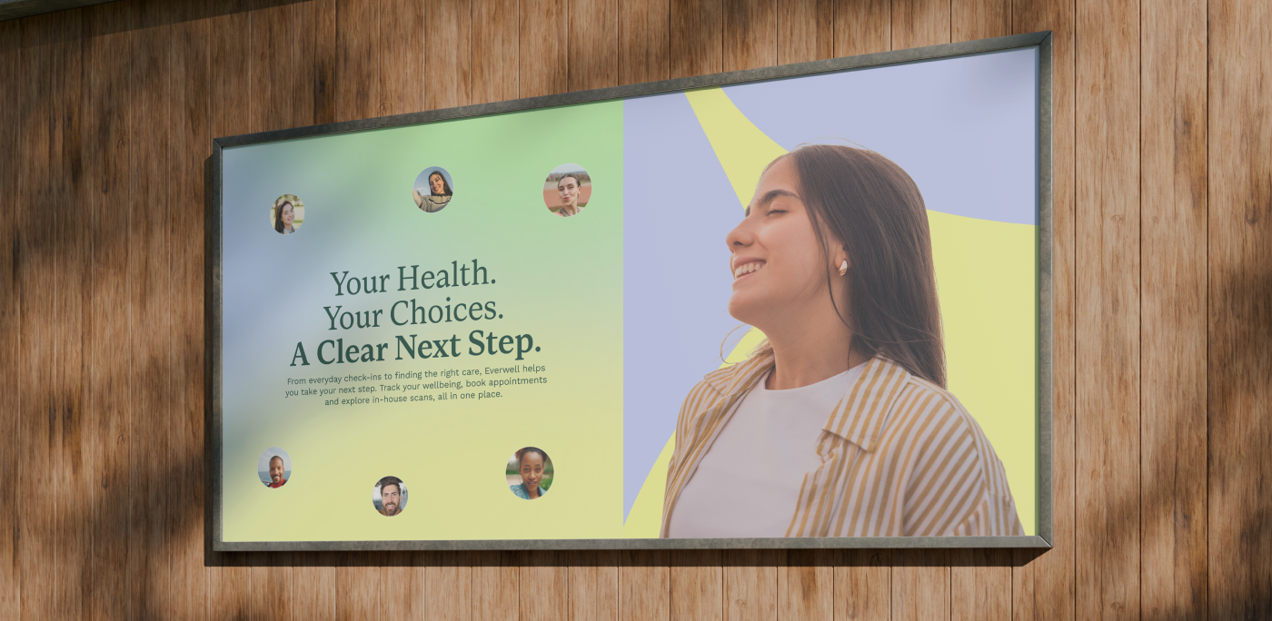
Everwell wellbeing campaign displayed on a wall-mounted screen
Everwell symbol on a soft green and blue gradient
Flowing wave graphic from Everwell’s visual identity
Everwell campaign portrait with bold yellow brand graphics
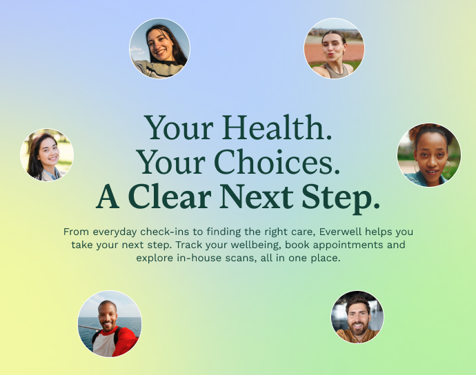
Everwell campaign layout: Your Health. Your Choices. A Clearer Next Step.

A human identity for connected wellbeing

The brief called for a distinctive identity that could balance the reassurance of healthcare with the warmth of everyday wellbeing. I developed a flowing symbol, custom wordmark and expressive colour palette, creating a visual language that feels confident, approachable and recognisable.

One identity, many experiences

The system had to work across brand campaigns, informative content, a responsive website and practical app interfaces. Consistent typography and recognisable graphic shapes provide continuity, while flexible layouts allow each touchpoint to serve a different purpose.
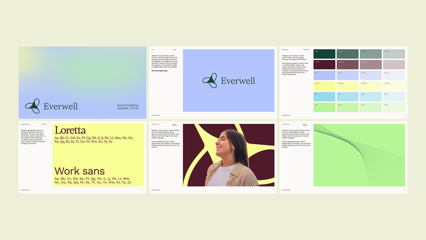
Everwell brand guidelines showing the logo, typography, colours and graphic system

A connected visual system that balances expressive brand character with clarity in everyday tasks.
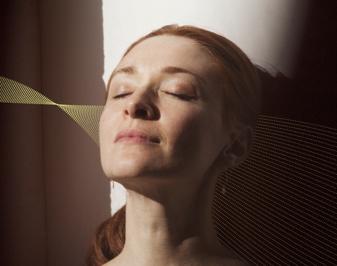
Everwell portrait photography combined with flowing wave graphics
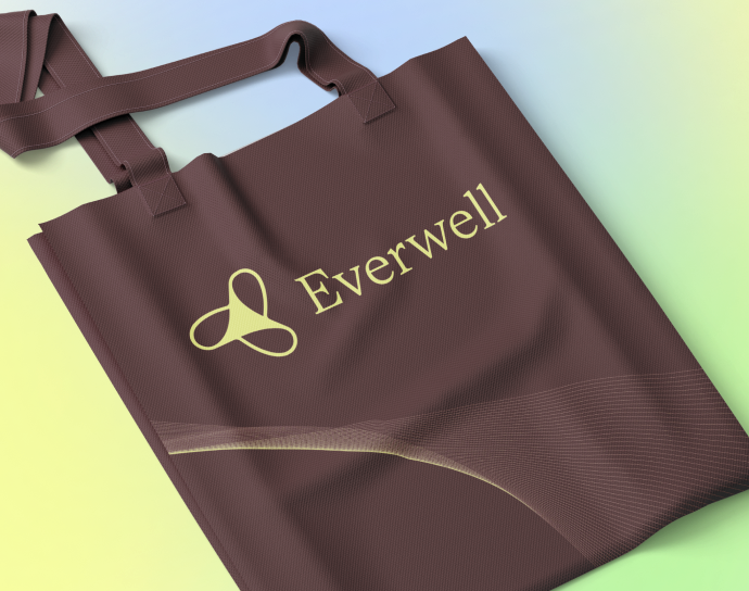
Everwell identity applied to a branded tote bag
Everwell photography direction showing people and healthcare
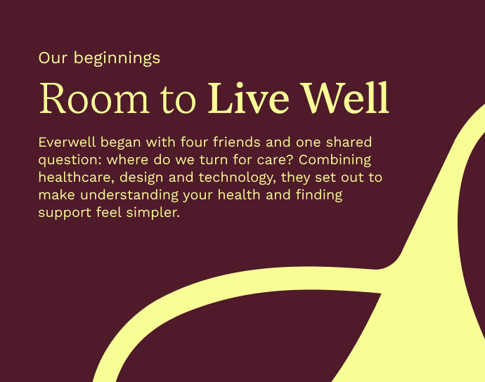
Everwell brand story layout: Room to Live Well

Connecting discovery with action

The website introduces services and creates clear routes towards the app, while responsive layouts keep information readable across devices. I carried the same visual principles into each screen so the experience feels like one connected brand, not a collection of separate interfaces.
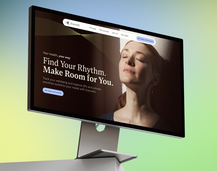
Everwell website homepage displayed on a desktop monitor
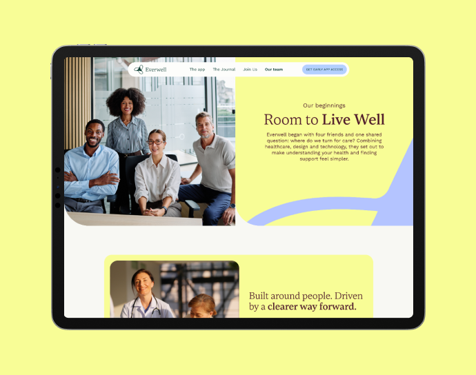
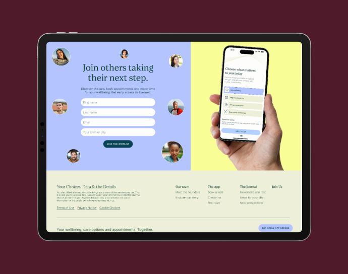
Everwell app introduction and sign-up page displayed on a tablet
Everwell About page displayed on a tablet
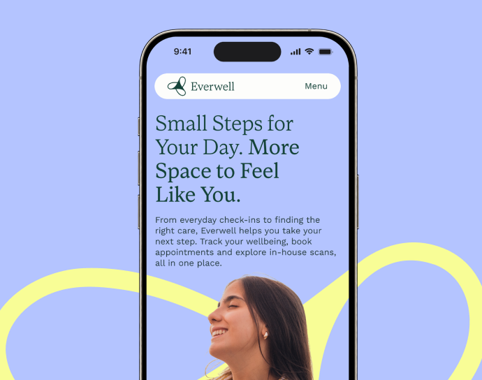
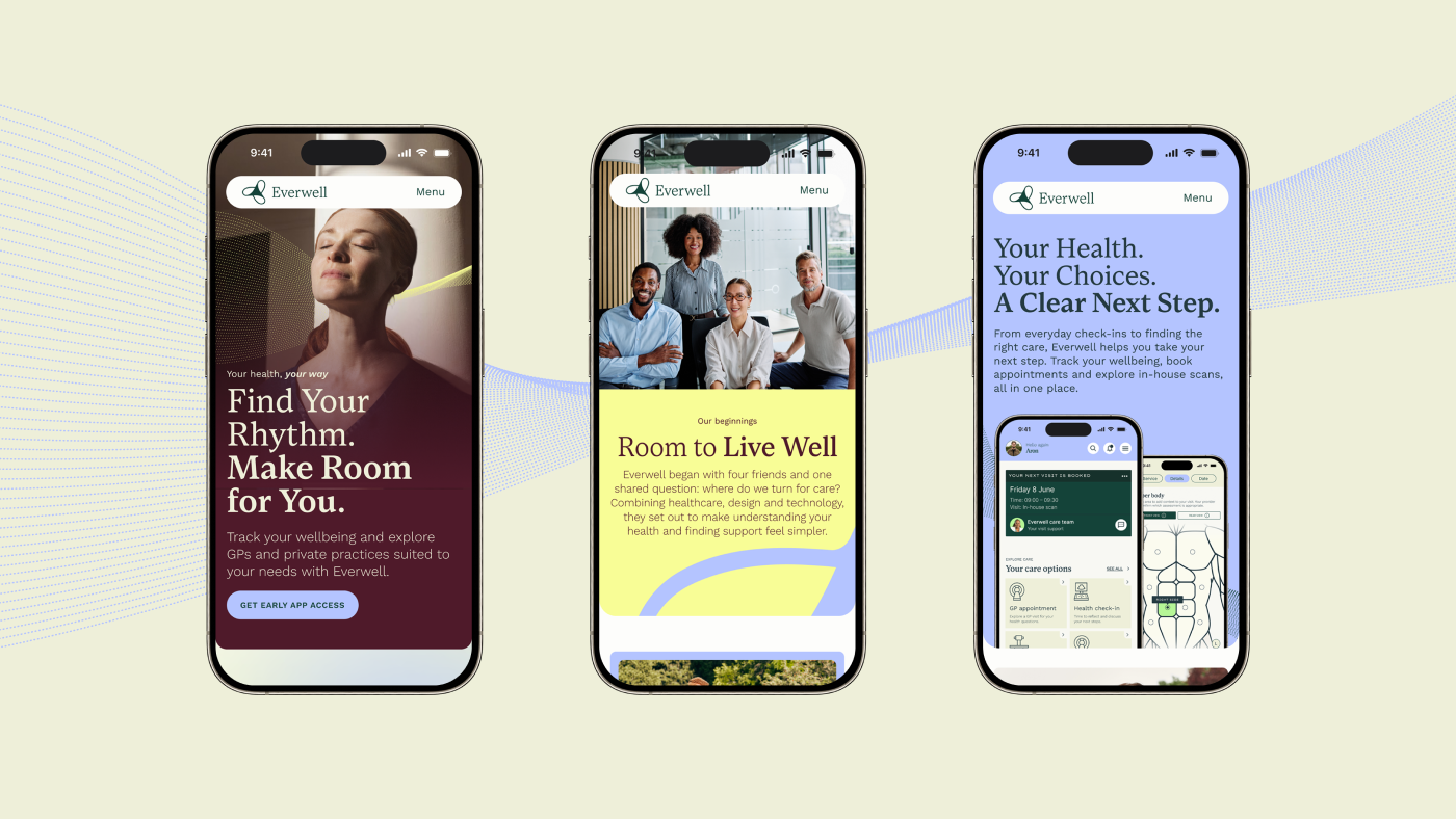
Everwell wellbeing website displayed on a mobile phone
Everwell responsive website layouts across three mobile screens
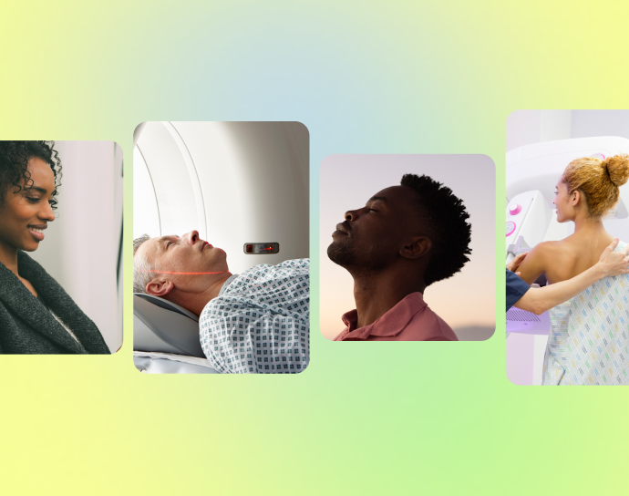
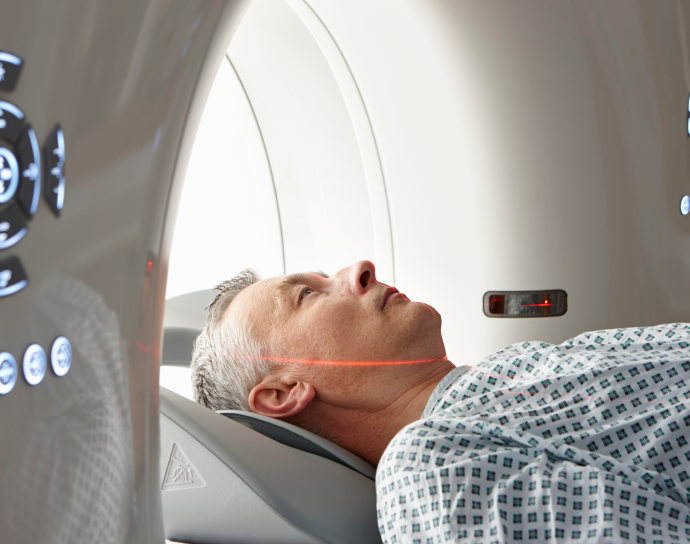
Person receiving a medical scan
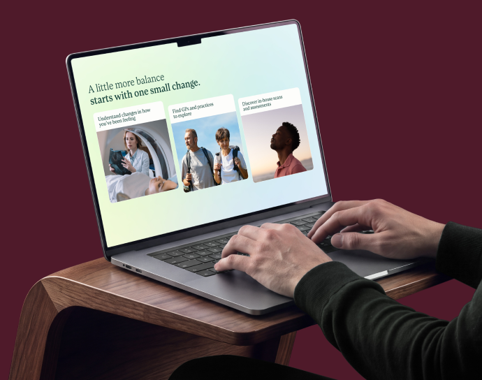
Everwell services website displayed on a laptop
Everwell outdoor campaign portrait with yellow wave graphics

From understanding the services to taking the next step, each part of the experience follows the same clear design principles.

Designing for everyday tasks

The app brings wellbeing check-ins, tracking and appointment booking into a cohesive interface. I designed focused flows, clear labels and straightforward decisions to simplify the journey from choosing a service to finding a date, while retaining the brand's personality throughout.
Everwell responsive website layouts across three mobile screens
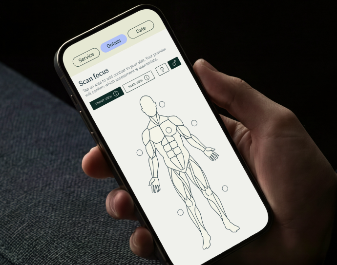
Everwell wellbeing app showing a body diagram and health information
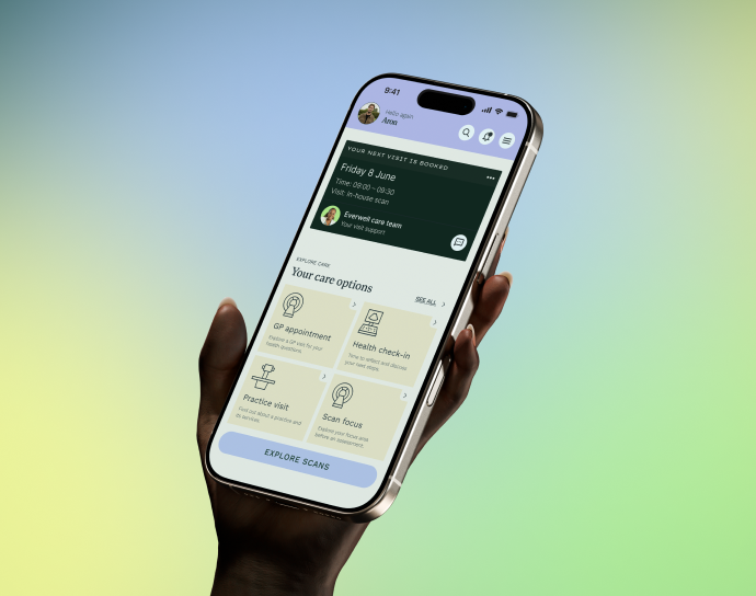
Everwell app dashboard displayed on a handheld phone
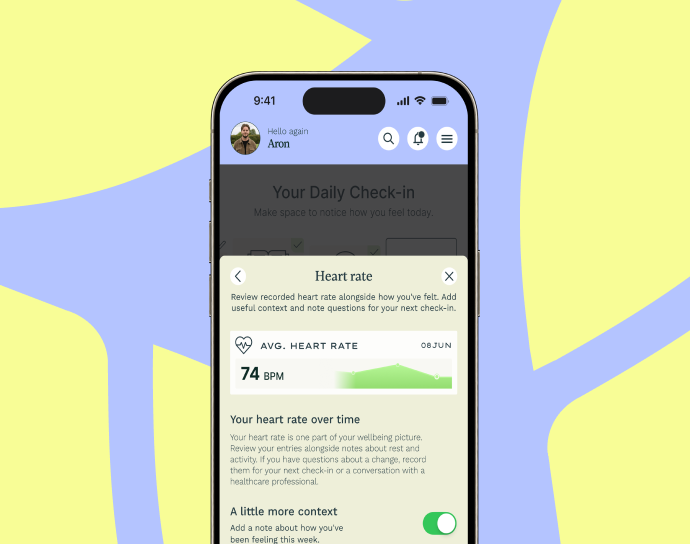
Everwell app displaying wellbeing information and a daily check-in
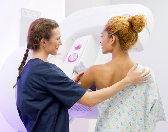
Healthcare professional supporting a patient during a scan

A joined-up design system

The result is a complete, connected design direction across identity, responsive website and app interfaces. Each touchpoint serves a different purpose while sharing the same typography, visual language and interaction principles — demonstrating how a strong brand system can bring consistency to complex digital experiences.
/ VIEW MORE PROJECTS
N. 03
Panovia project thumbnail

Panovia

View Project
Branding / UI/UX / Product
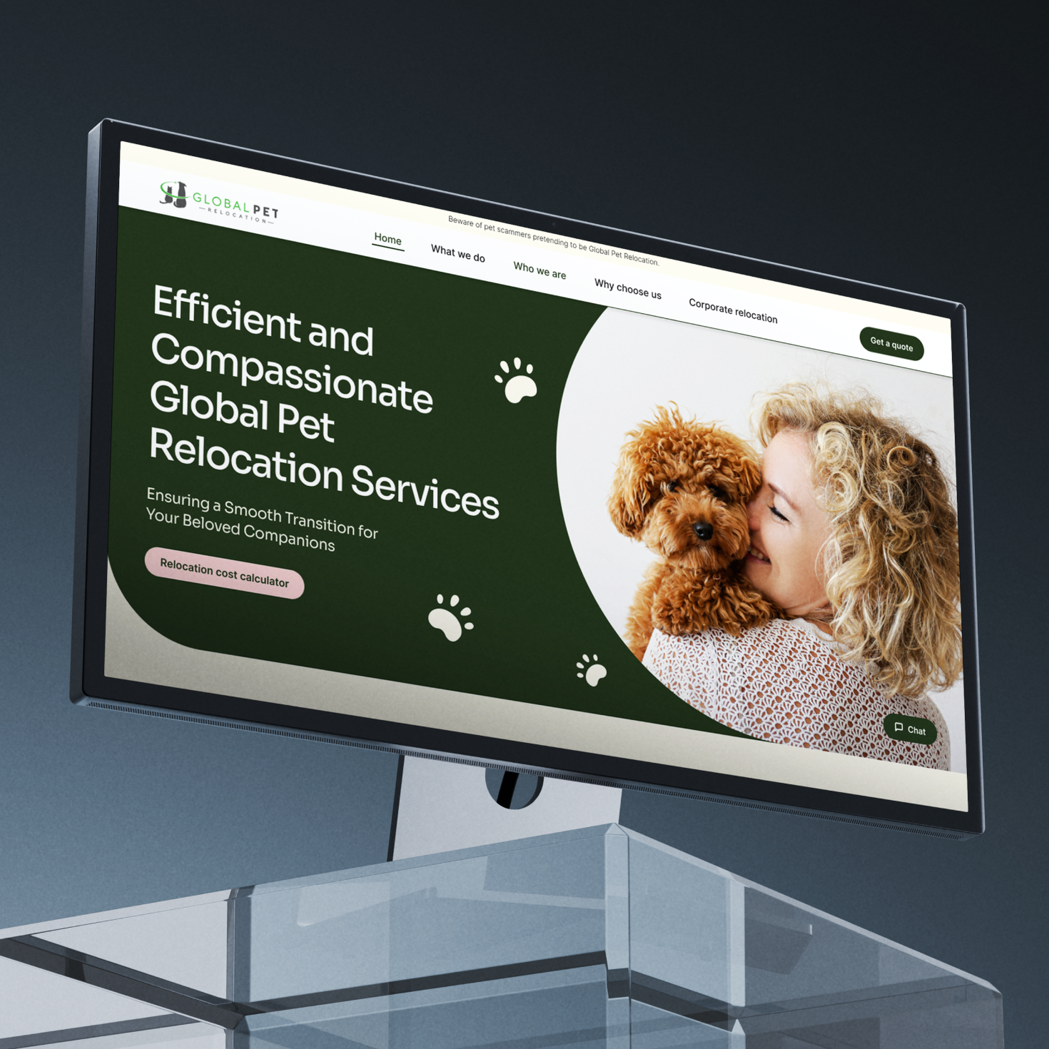
Global Pet Relocation project thumbnail

GPR

View Project
Branding / UI/UX / Product
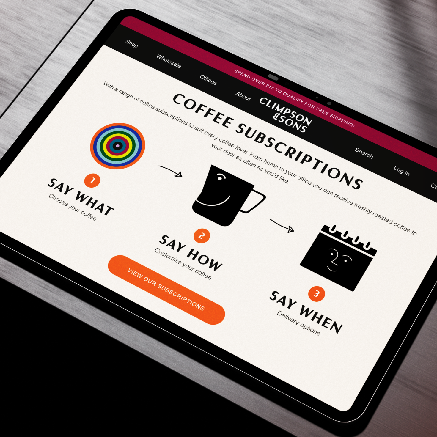
Climpson & Sons project thumbnail

Climpson & Sons

View Project
UI/UX / Ecommerce
Anything in Mind?
Let’s Talk
Contact