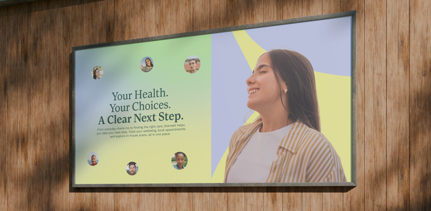



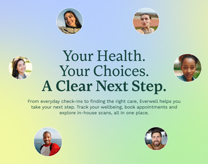
The brief called for a distinctive identity that could balance the reassurance of healthcare with the warmth of everyday wellbeing. I developed a flowing symbol, custom wordmark and expressive colour palette, creating a visual language that feels confident, approachable and recognisable.
The system had to work across brand campaigns, informative content, a responsive website and practical app interfaces. Consistent typography and recognisable graphic shapes provide continuity, while flexible layouts allow each touchpoint to serve a different purpose.
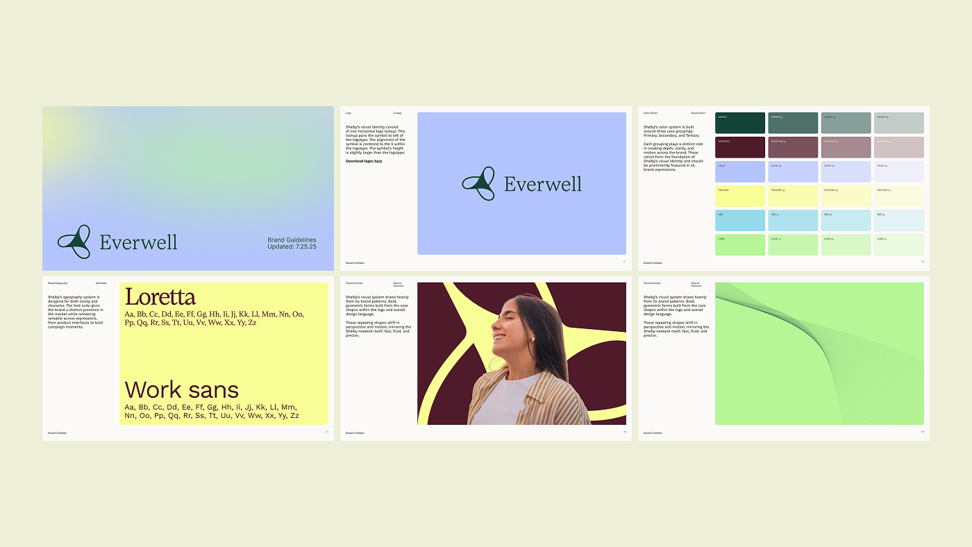
A connected visual system that balances expressive brand character with clarity in everyday tasks.
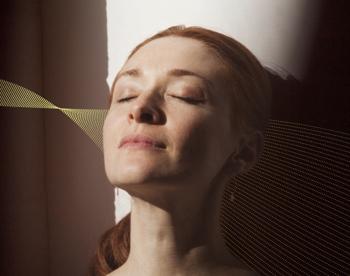
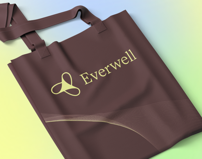

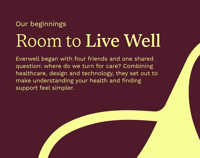
The website introduces services and creates clear routes towards the app, while responsive layouts keep information readable across devices. I carried the same visual principles into each screen so the experience feels like one connected brand, not a collection of separate interfaces.
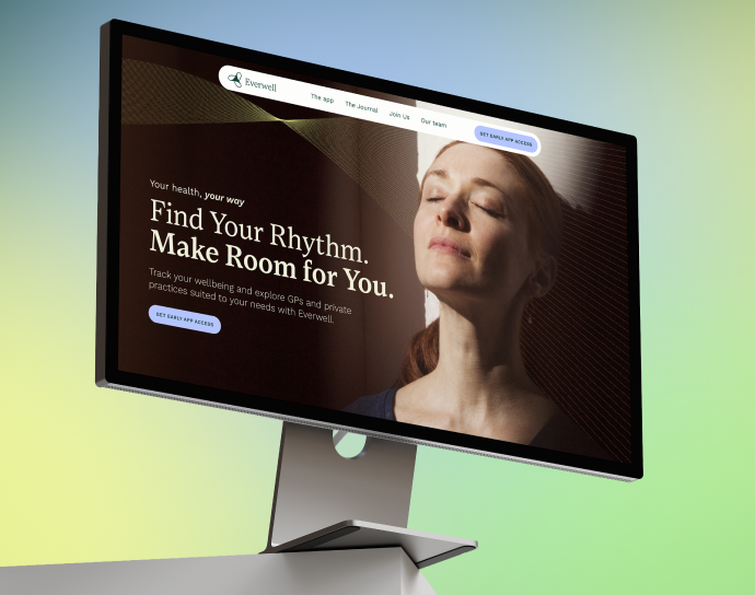
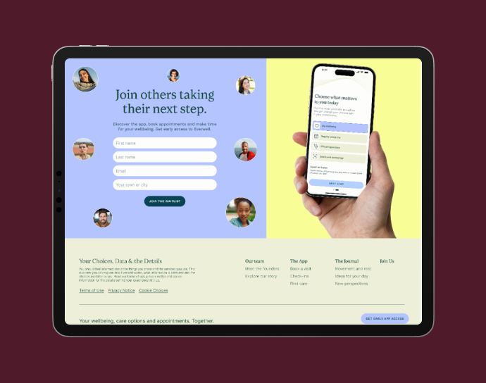
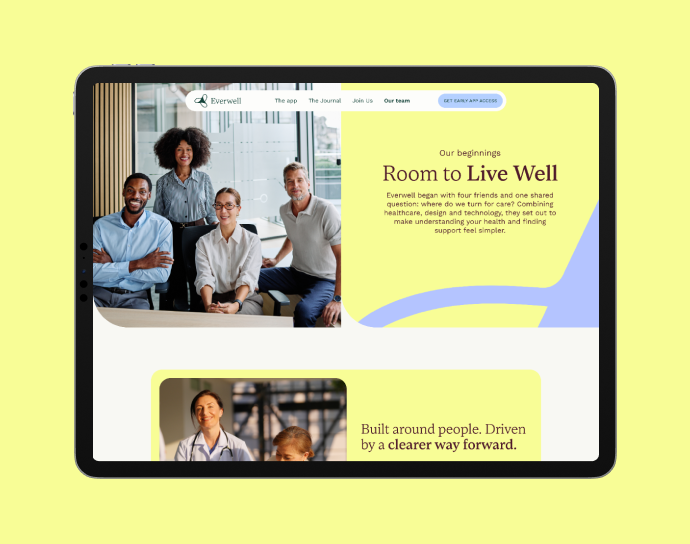
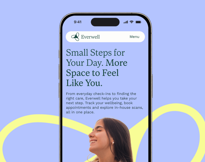
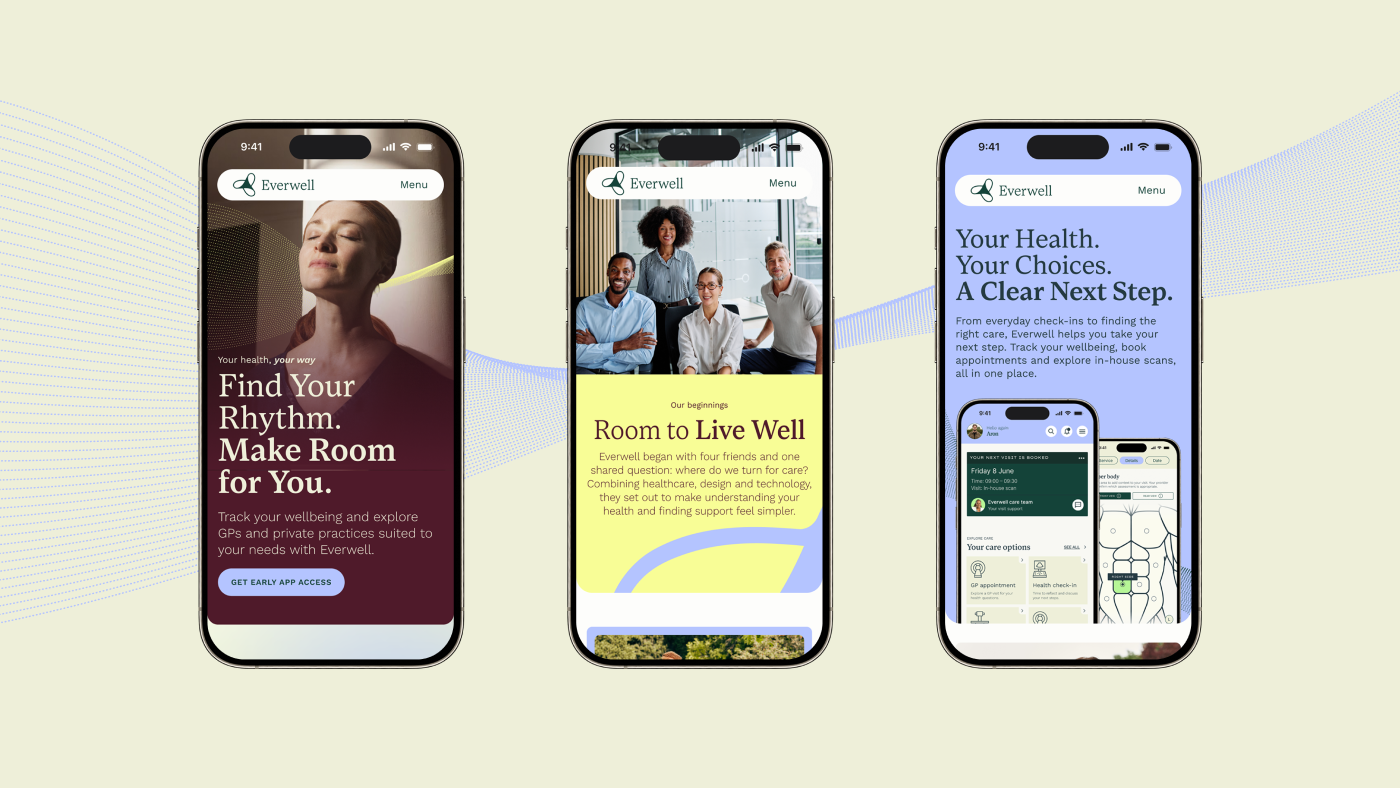
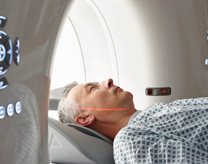
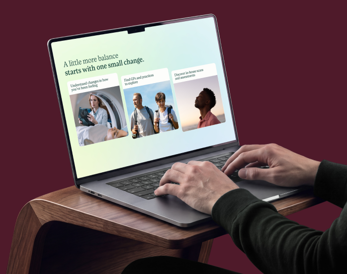

From understanding the services to taking the next step, each part of the experience follows the same clear design principles.
The app brings wellbeing check-ins, tracking and appointment booking into a cohesive interface. I designed focused flows, clear labels and straightforward decisions to simplify the journey from choosing a service to finding a date, while retaining the brand's personality throughout.
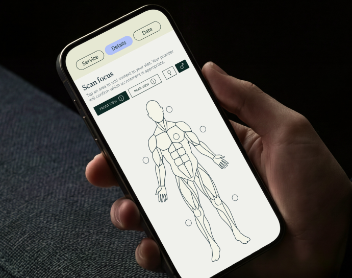
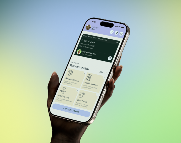
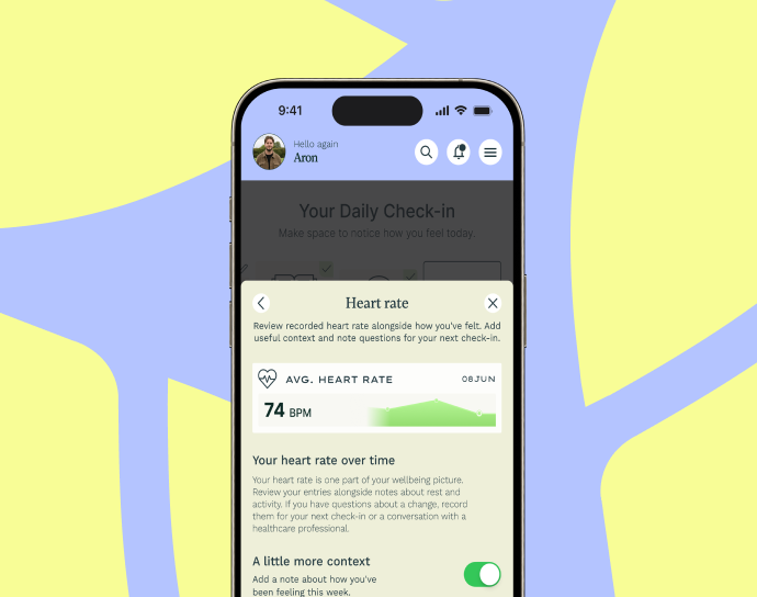

The result is a complete, connected design direction across identity, responsive website and app interfaces. Each touchpoint serves a different purpose while sharing the same typography, visual language and interaction principles — demonstrating how a strong brand system can bring consistency to complex digital experiences.