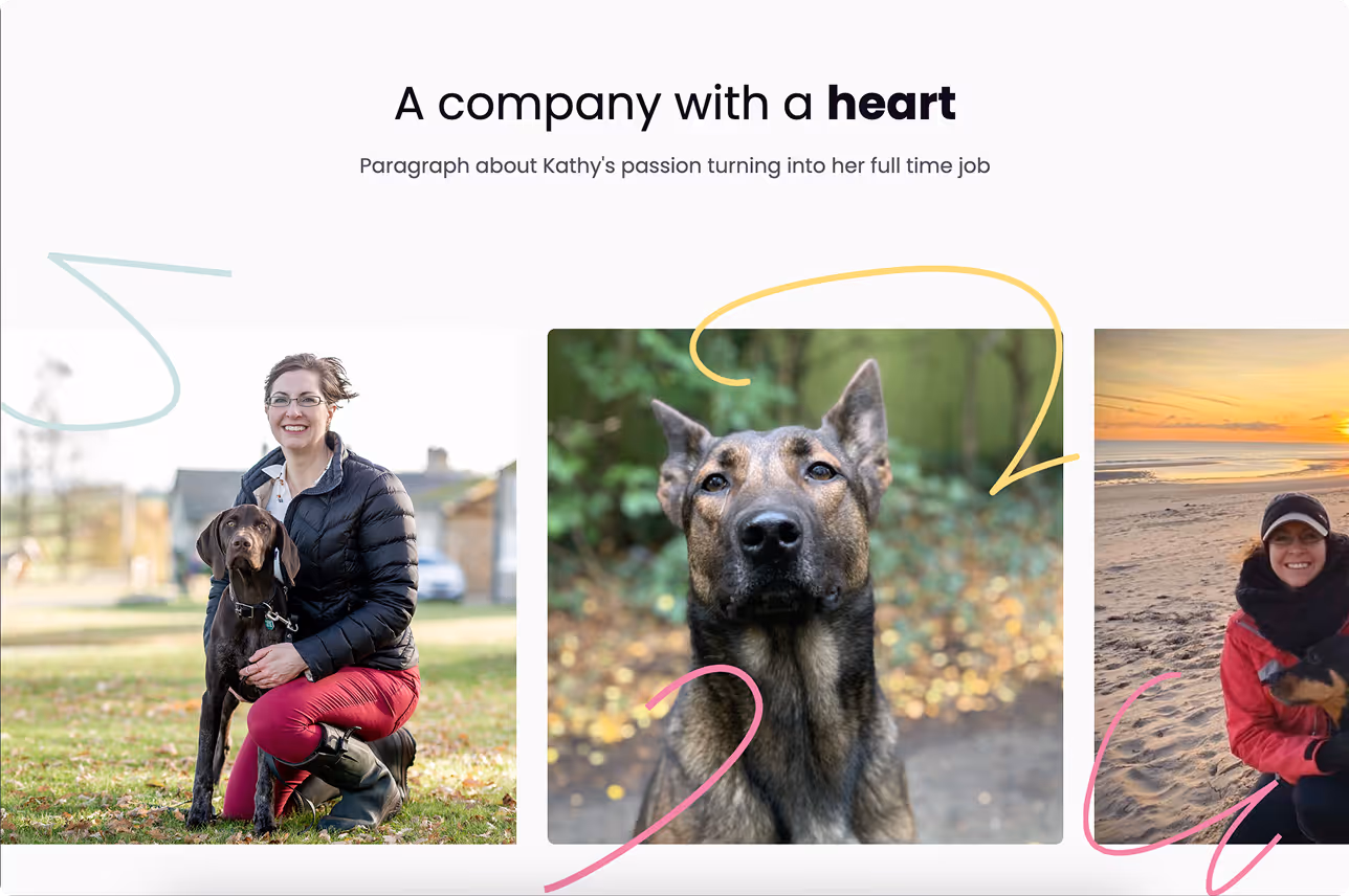
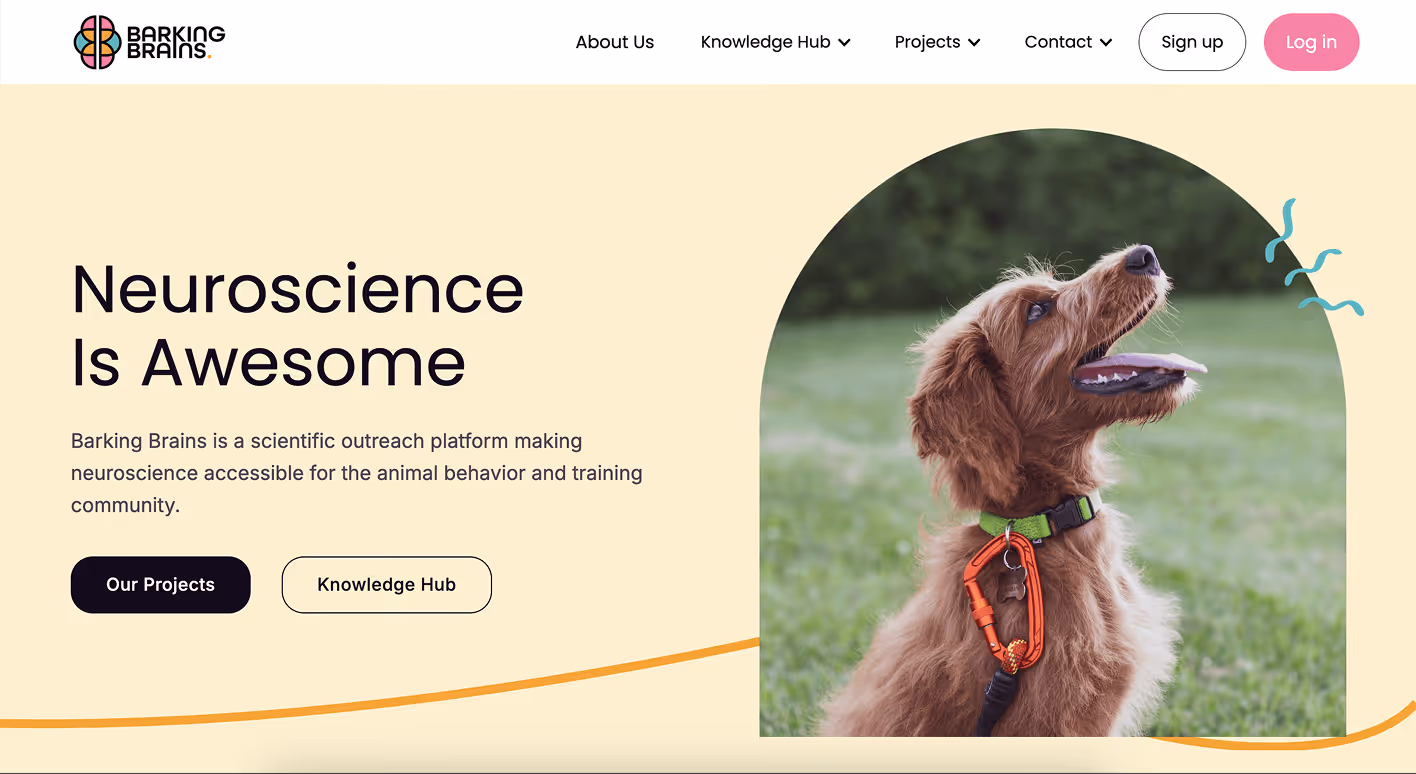
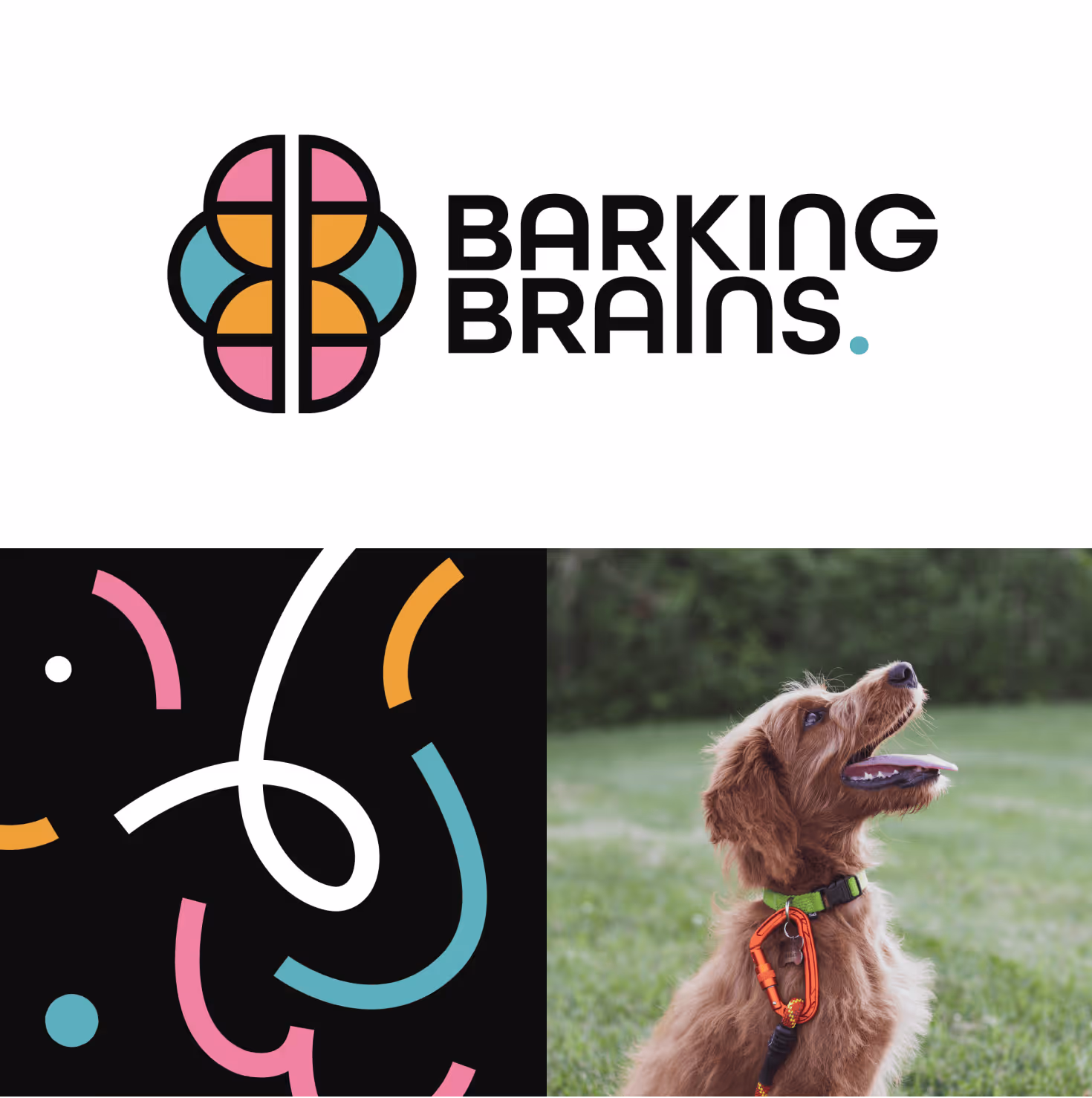
Science led organisations are often let down by visual identities that feel clinical and inaccessible, failing to reflect the energy of the community they serve. Barking Brains needed a brand identity that balanced academic credibility with genuine warmth and personality.
Client
Barking Brains
Category
Webflow and Branding
Final Result
N. 02
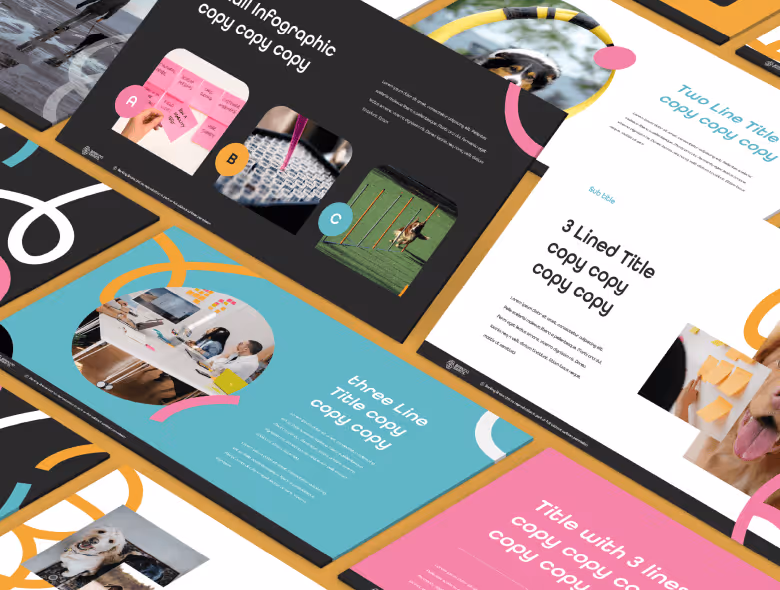
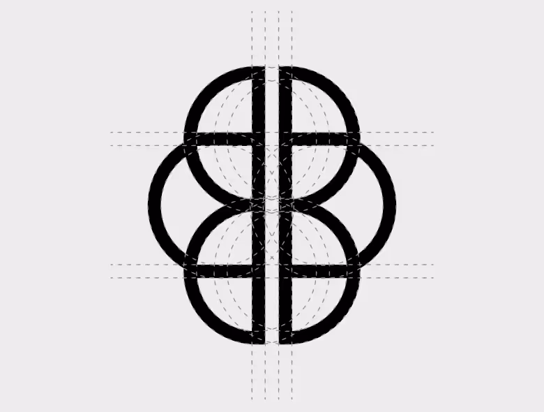
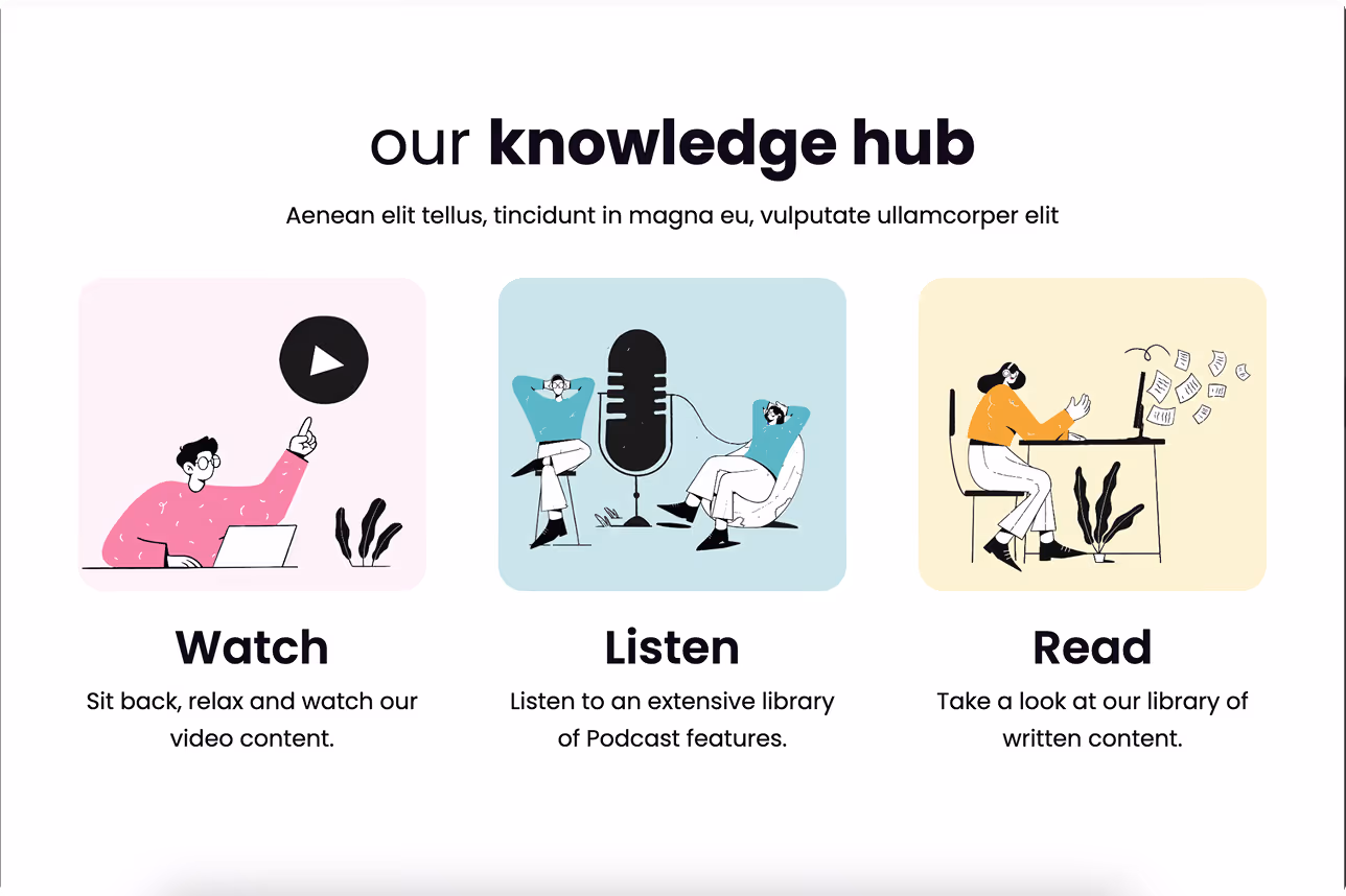
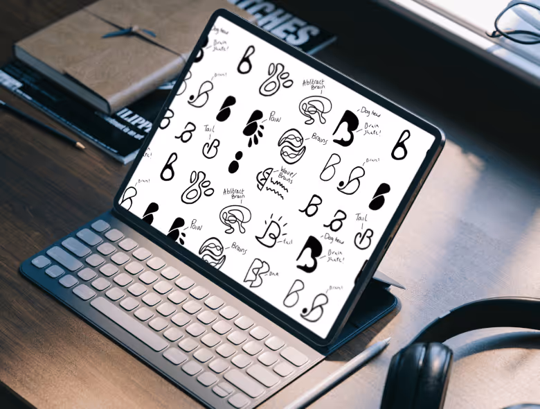
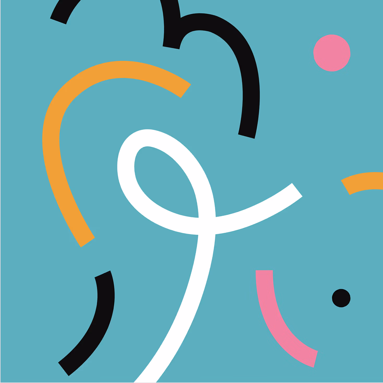
The identity centres on a custom logomark where two mirrored letter B forms combine to form the shape of a brain. Conceptually precise and visually playful, it communicates the brand proposition at a glance — the hallmark of considered logo design that rewards closer inspection. A bold colour palette and expressive pattern library were built around the mark, forming a flexible design system that applies consistently across contexts without becoming rigid. The system was then rolled out across branded collateral including PowerPoint templates, business cards, and a Webflow website, ensuring every touchpoint feels coherent and intentional.
The result is a brand identity that gives Barking Brains a visual voice worthy of its ambition, transforming a specialist outreach project into a distinctive, professional presence that builds instant trust with its community.