Whatskip

Introduction

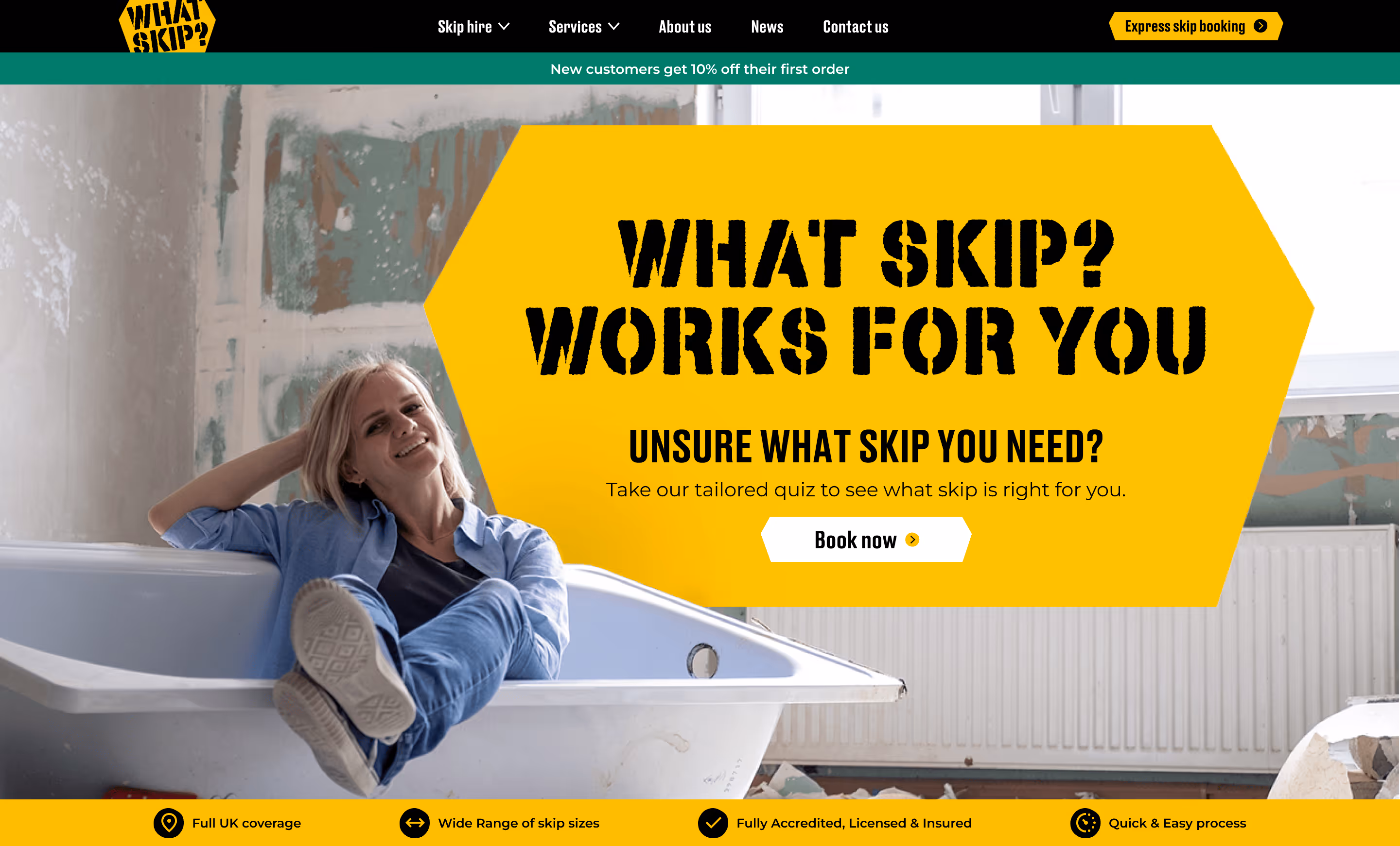
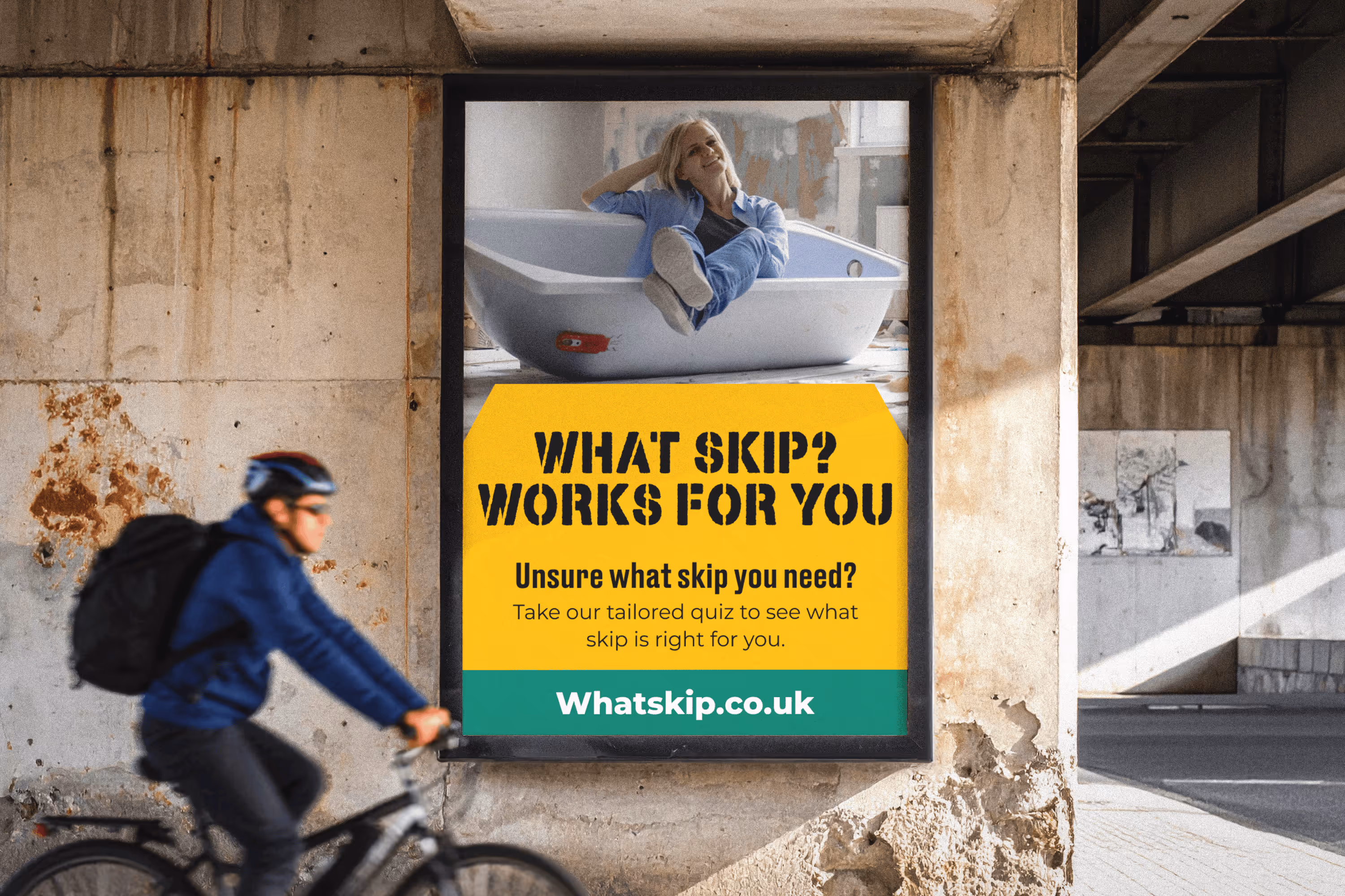
What Skip? is a national skip hire and waste management service backed by The Waste Brokerage Company, covering the full spectrum from domestic garden clearances to large-scale commercial waste solutions. The brand needed to feel approachable and efficient for everyday users, while carrying enough authority and professionalism to compete for commercial contracts. A dual-audience design challenge requiring a single, cohesive system that could serve both.

Problem statement

Skip hire is a commoditised, low-trust market dominated by outdated websites and opaque pricing. Users — ranging from homeowners doing a single clearance to commercial site managers — typically struggle to identify the right skip size, compare options quickly, or book with confidence. The opportunity was to create a brand and digital experience that cut through the noise with clarity, speed, and credibility.

Solution & key elements

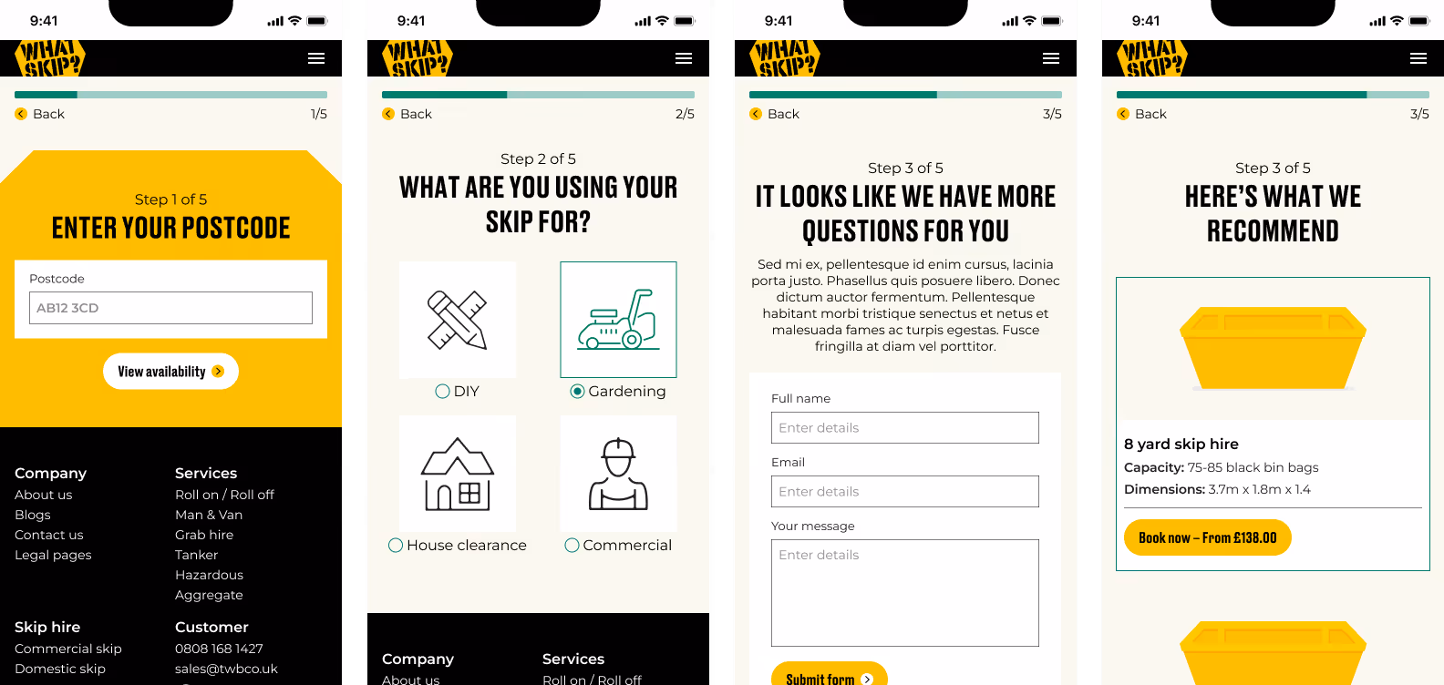
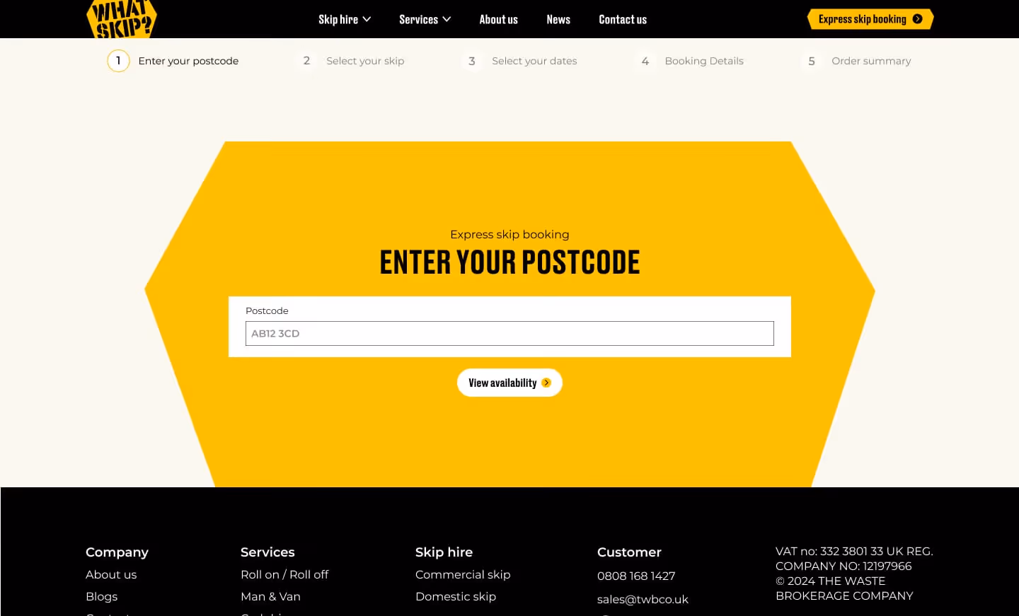
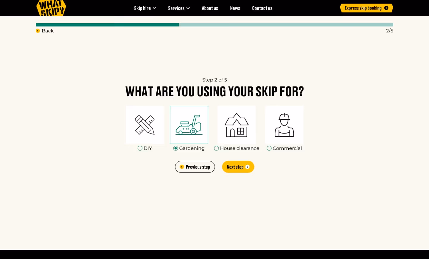
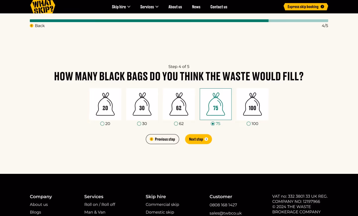
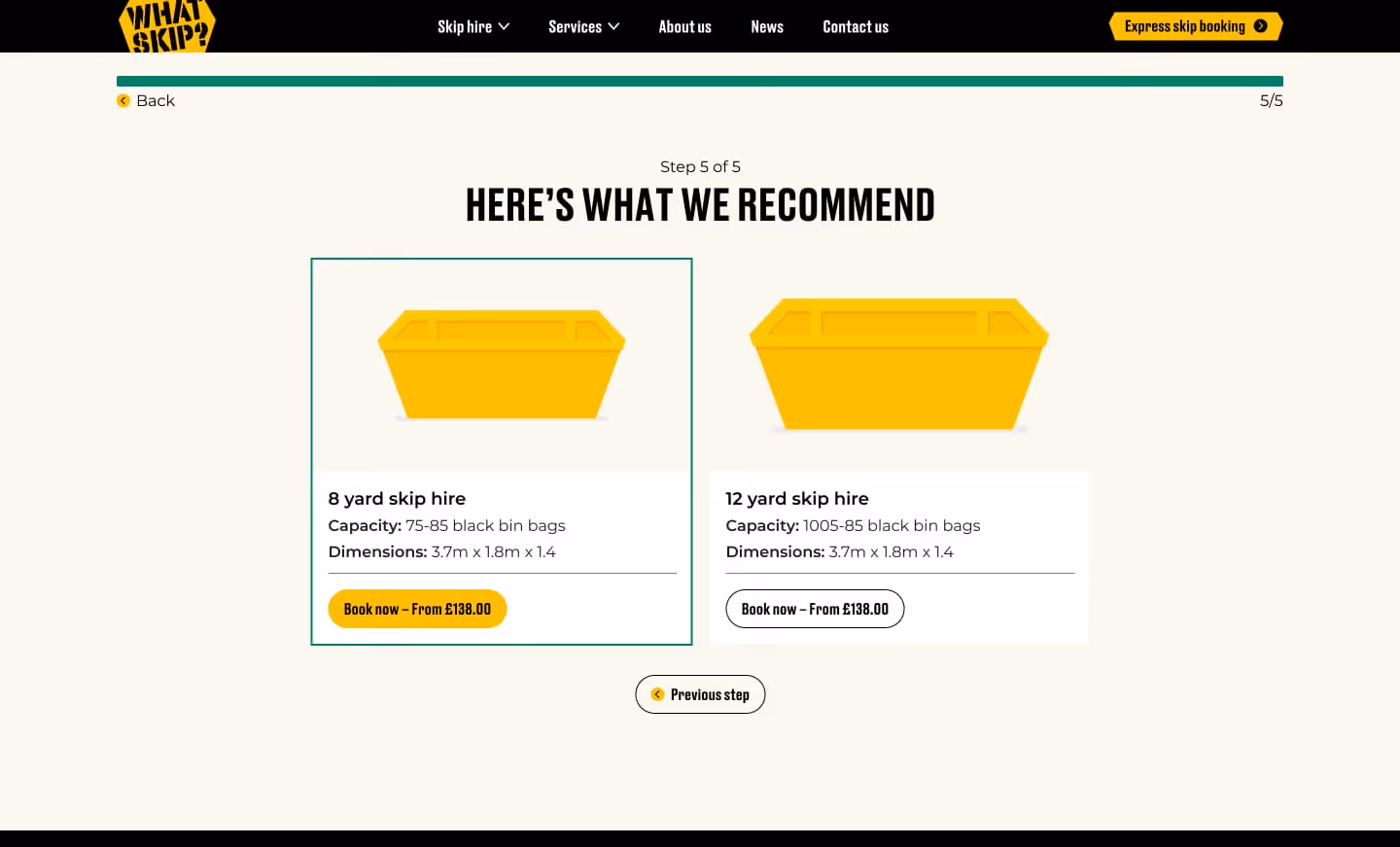
The design prioritises speed of decision-making the primary user need in this market. A clear, structured product range with standardised sizing information, capacity comparisons, and use-case categories allows users to self-select confidently without needing to call. This user-centric approach reduces friction and supports the express booking flow as the primary conversion path throughout the site.

A consistent design system underpins the entire experience from iconography and typographic hierarchy through to the card-based service architecture. Ensuring the brand scales cleanly across a wide range of service pages without losing coherence. Trust signals including Environment Agency accreditation, Safe Contractor certification, and Trustpilot reviews are surfaced at key decision points, following best practice conversion design principles.

The navigation is structured to serve both audience types without compromise domestic users land on familiar, jargon-free language, while commercial users can quickly route to relevant services. Accessibility considerations including clear contrast ratios, legible type scales, and unambiguous CTAs ensure the experience works for all users regardless of context or device.

The result is a brand and site that elevates what is typically a forgettable transactional experience into something that feels fast, trustworthy, and easy — turning a commodity service into a clear first choice, and reducing the reliance on phone-based enquiries by empowering users to make confident decisions independently.